2023 Update: New scalable version using font-size and animating transform instead of position for better performance.
I recently discovered that by adding appearance: none to Form Elements, that it essentially unlocks the ability to use :before and :after styles. Which means you can do more with just a plain old input field without any supplemental HTML.
I was able to turn a checkbox into a nice little toggle switch.
Check it out:
HTML
<input class="toggle" type="checkbox">CSS
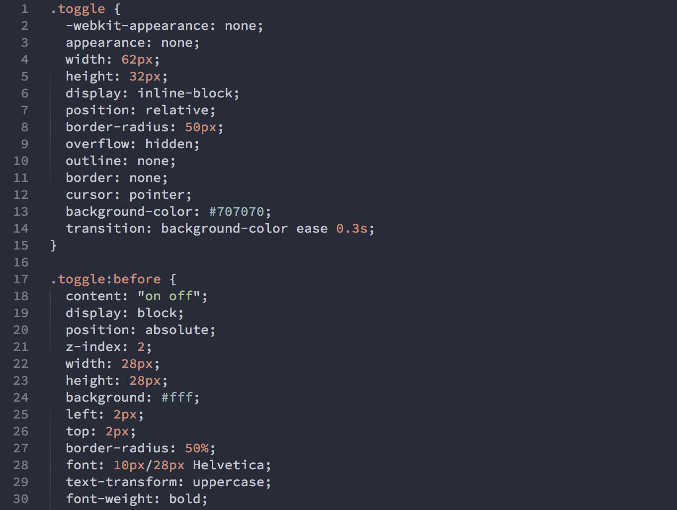
.toggle {
  appearance: none;
  position: relative;
  display: inline-block;
  box-sizing: content-box;
  width: 4.5em;
  height: 2em;
  padding: 0.2em;
  border: none;
  cursor: pointer;
  border-radius: 1.5em;
  overflow: hidden;
  background-color: #707070;
  transition: background ease 0.3s;
}

.toggle:before {
  content: "on off";
  display: block;
  position: absolute;
  z-index: 2;
  width: 2em;
  height: 2em;
  font-family: system-ui;
  font-size: 1em;
  line-height: 2em;
  font-weight: 500;
  text-transform: uppercase;
  text-indent: -2em;
  word-spacing: 2.55em;
  text-shadow: -1px -1px rgba(0,0,0,0.15);
  white-space: nowrap;
  background: #fff;
  color: #fff;
  border-radius: 1.5em;
  transition: transform cubic-bezier(0.3, 1.5, 0.7, 1) 0.3s;
}

.toggle:checked {
  background-color: #4CD964;
}

.toggle:checked:before {
  transform: translateX(2.5em);
}